#2 - Late to the party

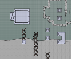
Firstly, Happy Holidays everyone! I hope the end of this year has treated you well and I pray that this new year is better overall than the last few. I'm writing this update in-between power outages so I might be able to post this before the year ends. Wish me luck!
Now for the news I'm sure most of you are aware of. I'm going to miss the 2022 deadline I gave myself for this update. I had a lot more availability and discipline to focus on a project like this in early 2022. But inevitably life happens and it threw a few curve balls my way that gave other things and projects in my life a higher priority. Boo hoo me, and I apologize. It's been a learning experience and its the first time I've tackled a project like this. I'd like to think I've learned what to do better next time and hopefully future updates happen more frequently from here on.
That said I do have some progress pics to share!
Night Strike

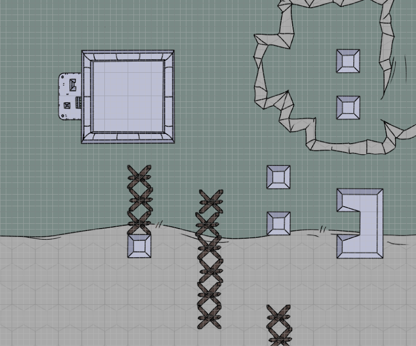
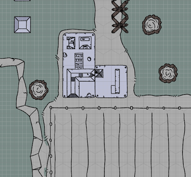
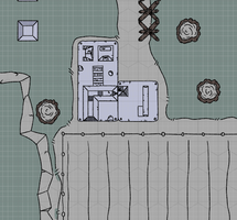
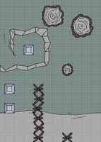
I think I've got the linework where I want it. Hard part is coming up with a color palette I'm happy with. For the project as a whole I wanted to stick to a faded and limited palette. To try and give off an older "war documentary" feel. It has added benefits of making it more efficient to color and shade these maps and also making any potential icons used in your tabletop sim of choice to pop out more. For all the chapter 2 maps I want to differentiate them from the palette I used for Chapter 1. All these conflicts happen during the night, and its also going to be (potentially if you all run your games like I do) the first time the players have combat within Evergreen. So I'm keen on trying more blues to give off that "night" feel. And use more plasticky whites for all the prefab buildings. That lighter color will also do well for any weathering I do to the buildings. It'll make them pop out more.
Reactor Defense

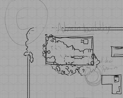
Only sketches right now, Inks are still a ways out while I find a layout I'm happy with. When I ran this campaign I used a map that was much more open and lacked a lot of cover. This led to the players staying in their spawning corner and simply sniping all the enemies. There wasn't a lot of tactics and dynamic combat. I'm hoping to change this by adding a lot of scatter cover throughout this map.
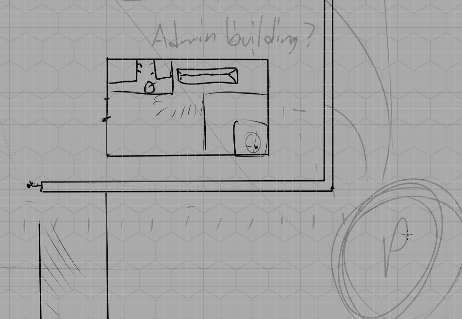
This is my first devilish counter. A big ol' building that blocks line-of-sight to the Generator and the NPC combatants. Players will likely spend their first move circumventing this. Either by moving around it or blowing it up.

The NPC combatants' choice for circumventing this building should be obvious. BLOWING IT UP!!!! I like to include a little bit on environmental story telling in my maps. For Shapter 2, the players are having to move all around Evergreen trying to catch up to all these combats. I like to think that they're joining these fights mid-combat. In the above example the Demolisher has already breached the Reactor's Defenses, stomping through one of the admin buildings, and is a few moves away from attacking the Reactor itself! The enemies have the upper hand in this combat and should already be in optimal places for fighting the players.
The Demolisher's spawn should really act as a combat timer. It can destroy the Reactor in only a few turns, so his distance to it should determine the difficulty of the encounter. Farther away, he'll spend more of his turns moving up to the reactor. Closer and he spends his turns dealing damage. In the example above I'm spawning the demolisher 2 turns away. Giving the Demolisher some 3 of total 6 turns to destroy the reactor. Players are going to want to act fast! Encourage your players to bring equipment or tech actions that can push enemies around.
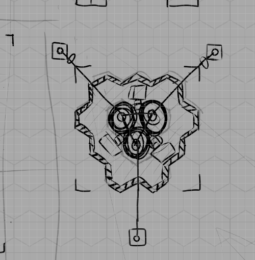
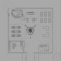
Even as a sketch, I really like the look of my Reactor. Three giant coils connecting off to come miscellaneous wires leading to who knows where. It makes me want to add arcing electrical bolts and other dangerous looking effects! It's a Size 2 template set inside a Size 4 warning line. Speaking of lines, the darn thing is set in the middle of the map. For my game I want it to block Line of Sight too, so Players and NPC's have to dance around it in order to target and deal damage to each other. It also gives Arcing and Smart weapons a chance to shine. Until then, enjoy my roughs sketch version of the map.
REGRET
Oh man. I am excited to work on this one. REGRET is one of the QUINTISENTIAL Wallflower combats. It's infamous. It's difficult and is full of Player "OH SHIT" moments. It's the turning point of the campaign and a huge difficulty spike at that. I don't have any map art to share at this time for it. But I know what I want to use for a layout:
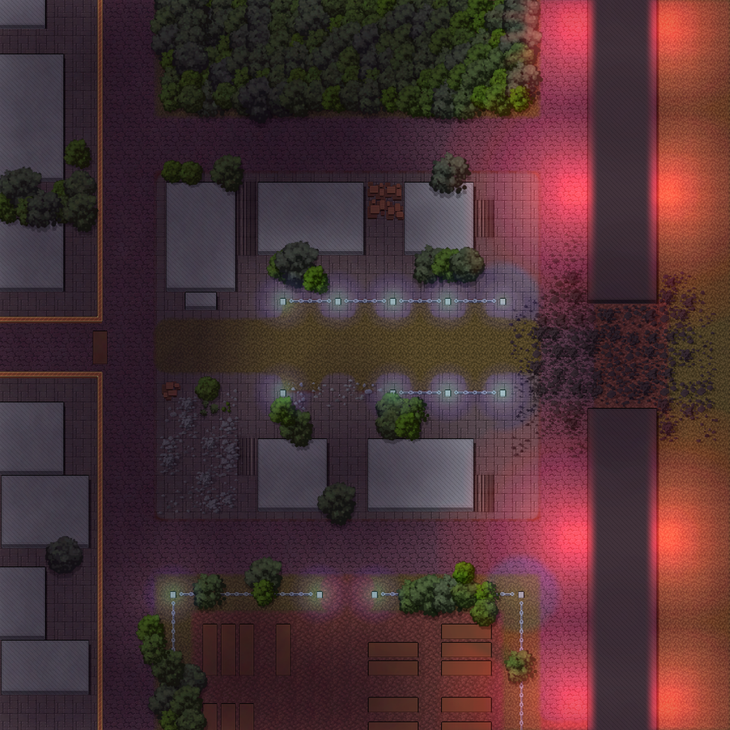
Before I started drawing my maps, I used RPG Map Editor 2 for my map making purposes. It's a fantastic little program and is one of my preferred map making tools. The above map is actually in the community Wallflower google drive linked in the Lancer Discord server. A bunch of my old maps are. But I LOVE this layout and I'm excited to revamp it in my drawn style. Much like RD, the players are joining the fight after it started. The enemies have already breached the wall and destroyed a building. And they're about to destroy more!
There's a few adjustments I want to make. Right now the top and bottom of the maps are more filler and don't get a lot of love. I want to find some kind of purpose for them in a mechanical sense. When I made the map initially it was for set dressing and giving a place for enemies to spawn. The other problem I have with it is there's no cover in the middle of the map. When I first ran this the players spent their time sniping from the edge of the map and not getting into the fray. REGRET is primarily a melee mech so in this update I'm gonna try to funnel the players into the buildings with the big bad.
I don't have a timeline for when Chapter 2's maps will release but I hope to get them out sooner than later. I can't thank you all enough for checking out and downloading my mappack. I genuinely feel honored. It still feels surreal that people use my art in their games and damn it feels good. Chapter 2 "Late Spring" will be coming soon in 2023 to people who bought the "print" versions of Chapter 1's mappack.
Once again, Happy Holidays and Happy New Year to you all!
~ Void
Get VOID'S WALLFLOWER MAP PACK
VOID'S WALLFLOWER MAP PACK
Massive map pack themed after LANCER: NO ROOM FOR A WALLFLOWER
| Status | In development |
| Category | Assets |
| Author | Casually Nefarious |
| Tags | battlemap, dnd, lancer, landscape, Mechs, Sci-fi, Tilemap, Tabletop role-playing game, VTT |
More posts
- #3 - Early Release and AnniversaryJul 29, 2023
- #1 - Post launch and NIGHT STRIKESep 03, 2022
Leave a comment
Log in with itch.io to leave a comment.