Post Jam and The Future

First and Foremost,
HOLY CRAP WE PLACED TOP 3 IN ALL CATEGORIES.
I am absolutely floored by this and I can't thank you all enough. I don't take any of it for granted, I never thought my silly little project would rank so well let alone actually release. But here we are. Some three months past the Jam and the game is still being looked at, still being downloaded, and hopefully still being played. Thank you to everyone who voted. Thank you to everyone who checked it out and gave it a read. Thank you for reading this.
So, where have you been?
I took some time off. Jumping back and forth between doc files, publishing programs, aseprite and discord chats took a toll. While I love this child I made I needed sometime away from it to refresh. I went on hikes. I went on dates. Spiraled a bit. Got a bike. Destabilized a country as a treat.
Silliness aside I made a conscious effort to step away from the book making workflow for a bit. I loved the process and learned a lot BUT I didn't want to burn myself out. The last thing I want to do is resent this new love I found. That doesn't mean I wasn't watching this page and discussions about it like a hawk. Just because you didn't see me, doesn't mean I wasn't there. 👀
Now that some time has passed and FIST: TACTICS has had a chance to grow and live on its own for a bit, I wanted to talk about it. What the development process was like, things that got cut, things that caused problems, what I learned, and what I want to in the future. My hope is that some goober out there reads this and says "Shit, if this guy can do it then I can too."
From one goober to another, you got this! And Good luck.
So, how did this start?
It started sometime back in May. I was laid off three months prior and slowly losing my mind after upending my life, moving, and sending out job applications that went nowhere. Then one day my email service gifted me a link to a big FIST announcement. Oh shit. A new edition!
I was already a big fan of FIST. A friend of mine who's a fellow Metal Gear fan and acronym lover, gifted it to me. I loved its simplified PbtA system. I loved easy it was to make characters, and I loved how easy it was to quickly DM a game. It became my go-to one-shot game
I read further down and saw they were starting a Jam to celebrate:
Make something with our new game.
Make it in three months.
Make it polished.
MAKE
IT
So I met up with my friend who introduced me to the game and started brainstorming ideas. I had the free time for it and I was in dire need of a project. This was a perfect opportunity to spend 3 months making a thing. I had always wanted to make my own RPG book, design a bunch of art and come up with a fun layout. How hard could it be?
We came up with a bunch of ideas but the one that stuck the most for me was a mechanical parody. "Take FIST, a super lightweight and easy to play TTRPG, and make it a super crunchy wargame."
That's right. It originally started out as a joke. What can I say, I'm a funny guy.
So, what came before?
One of my first ideas was actually something more inspired by "Devil May Cry" type action games. I don't have much saved from it but player actions were tied to a "Combo" which was a fun way of randomly dishing out a number of actions in a turn. Regardless, FIST: TACTICS started off in a blank doc file with great ambitions and poorly worded rules:
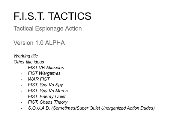
The title of the game was something I struggled with a lot. FIST: TACTICS was originally just a working title as I wasn't sure I could use the "FIST" name. I almost called the game SQUAD but I felt it didn't do a good job of relaying the tactical nature of the game I was making. I didn't want to lose it though as I LOVED that acronym. So I absorbed it into the rules itself.
For a good while the name was going to be NME: QUIET (Enemy Quiet), playing off the moniker "Enemy Territory" that was used in a few competitive games back in the day. While I think it did a good job giving of the competitive nature of the game it would have been a pretty terrible title. The worst part was my buddy and I could never come up with a good setup for the acronym. I'm not joking, we spent a few weeks just bouncing ideas back and forth:
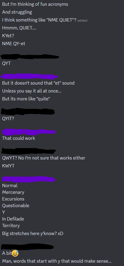
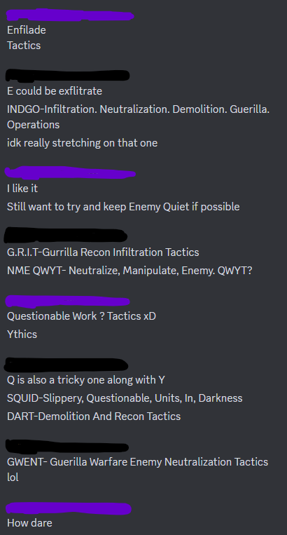
It was mid June that we were having this conversation. Imagine two doofuses saying "Quite" "Quit?" "Kit?" "Cat" "...quite?" over and over and that's essentially how it went. I wont lie, we had some great titles and acronyms but it was like trying to force a square peg in a round hole. Even if we made it fit, it wouldn't fit right. So FIST: TACTICS won in the end.
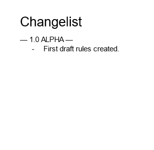
Quite the ambitions changelist there Kam. Don't worry, in time this page got filled out, if only to make it easier to see changes as development went on.
The first version had a lot of "this would be cool" things that ended up getting cut. Either for time or lack of playtesting. For example:

I wanted there to be security systems. Cameras, lasers, locking doors, turrets, environmental hazard, etcs. I didn't make enough time to include these aspects to the game. These systems got absorbed into the patrolling and stationary guards.
In this early version I also had a rough idea for Partial Successes. One of the key features of PbtA adjacent systems like FIST. But I found it hard to develop for.
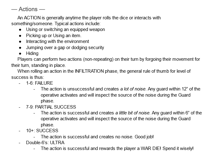
In the final version of FIST: TACTICS there are 17 actions, 11 of them require someone to roll dice. Trying to account for 11 tier'd outcomes, some 44 different results would be a lot of work. In a tactics game like this I wanted to reduce the amount of times a player would have to check the rules, and I could see that happening with partial successes. For example, making a 7-9 roll make a noise is fine for the stealthy half of the game, but what happens during the ALARM Phase? The guard's know where everyone is there's no need to track for who is getting alerted.
As written it also led to a scenario where a guard could soft lock and freeze during their pursuit. Potentially locking or cornering a player's operative. Now that I think about it that could make them a little more powerful during play... But for the full release I axed the Partial Success. I found it better to keep everything within the 1 to 7+ range to be a binary result. Less rules to have to remember and it made the dice rolls easier to understand at a glance. Plus it meant less work overall.
FROM THE BEGINNING, I wanted FIST: Tactics to be an easy mod of the base rules. Even if this started out as a joke I didn't want the game's functionality to be the punchline, only its concept. As much as possible, I wanted players to be able to use their FIST ULTRA characters from the base game.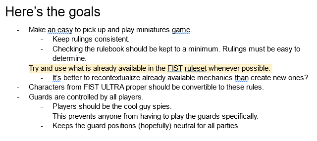
The biggest hurdle to cross was the TRAITS. The classic edition had 100 traits, the ULTRA edition had 216. I don't know about you but those are some ludicrous amounts. I'm a man of many aspirations but trying to convert all 216 TRAITS was an inhumane practice of Sisyphean ideology!
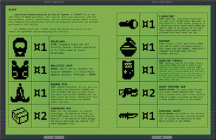
See, a majority of these traits have a heavy role-play focus without an easy mechanical conversion. At least, a conversion that wouldn't require making very specific rules. Paired with a limited amount of time, I started developing a shortlist of the ones that I thought would work the best in a tactical game. My goal was to get at least 36 TRAITS converted over which would fit nicely in a d66 table. By the full release I exceeded that goal and got 72 TRAITS converted over. 33% may not be a passing grade but it feels like it is to me.
A Highlight on my Collaborators
FIST: TACTICS wouldn't be half the game it was if not for the help of my amazing team. A lot of hands went into this stew, even if most of them would only admit to going pinky deep. I want to use this section to give a highlight on some of the guest artists who came on and gave some of their valuable time to me.
Javier
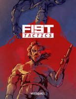
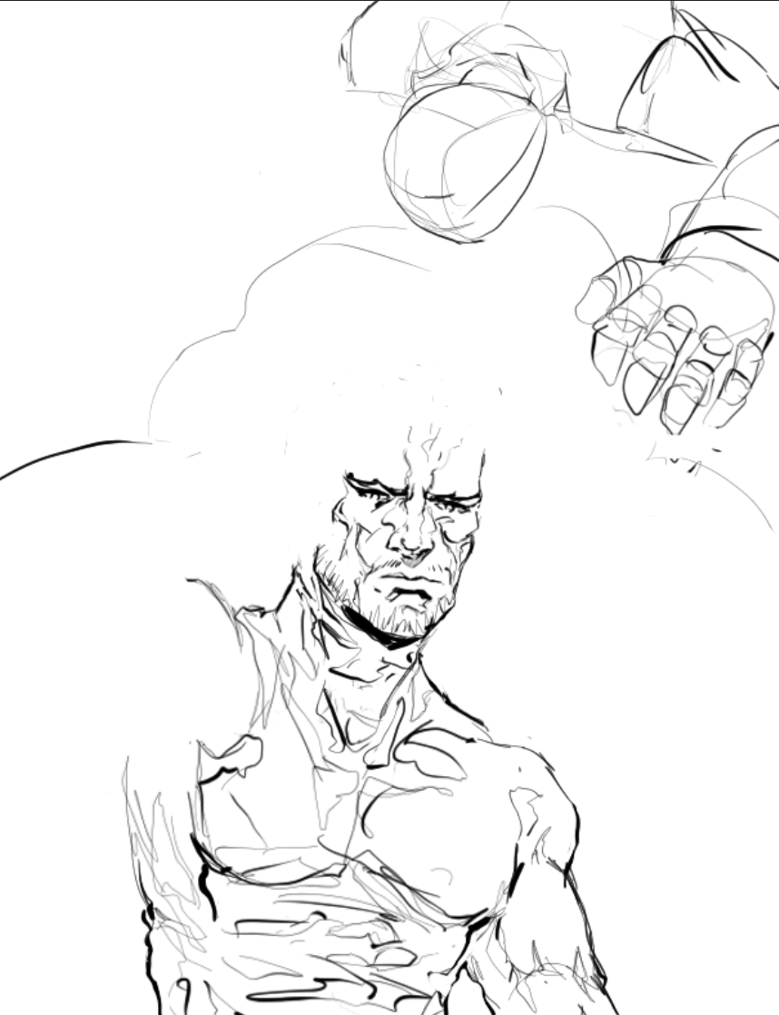
Javic is an incredibly talented artist and someone I am so excited to have gotten the chance to collaborate with. Man's got the same love for Kojima's nonsense and Yoji Shinkawa's scribblings that I do and this was a beautiful opportunity to tap into our shared enthusiasm. I brought him on to make the cover art for the book. WHICH OH MY GOD WOULD YOU LOOK AT IT!!!! I love how striking his colors are, and the inks on this guy are so freaking clean. He also chipped in and made the beautiful background graphic on the store page.
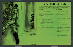
He came in clutch towards the last few days of working on the game. The man knows a thing or two about book formatting and I can't thank him enough for going through the early versions and redlining all my weird spacing, odd formatting choices, and dissimilar stylings. Without him this book wouldn't be nearly as pretty. Check out his Instagram here and tell him I sent ya over. Then go buy some art from him. Dude's a master, even if he won't admit it. I MEAN JUST LOOK AT THIS ROUGH SKETCH HE MADE OF THE COVER:
Pai
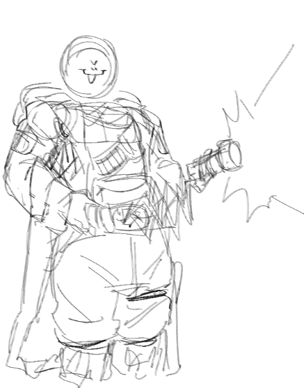
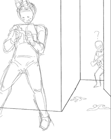
Pai is one of the funniest people I've ever met, and an absolute pleasure to work with. They've been a longtime supporter of my work and I've been dying to collaborate with them for a while. With FIST: Tactics I found this rare opportunity to tap into their gremlin energy. And boy howdy did they deliver! Check out their socials here and go commission them. PLEASE. While you're waiting for them to respond take a lookisee at these sketches they sent my way:
Miffix
Miffix if you're reading this you are lovely and wonderful and I can't thank you enough for all the work you did for me. Miffix is one of my best friends and one of the hardest working artist's in the biz. I love their art and will take any opportunity to shill them like the rabid fanboy I am. They gave me some good design help and helped me finalize the key art for the game. And my god they gave me some excellent art to put in my game. Please go give them some love over here. And if you love their stuff as much as I do, go commission them.
I primarily tasked them with drawing the guard line-up, showing off the different types the players could end up running across. Here's my original concept:
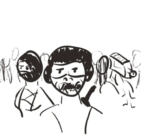
Not too shabby, decent layout but needs A LOT of refinement. AND THIS IS WHAT THEY SENT BACK:
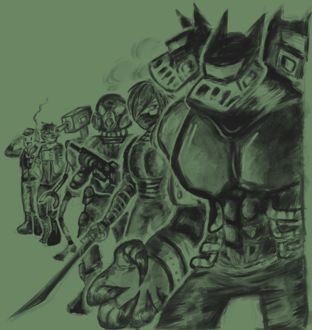
OUGH she spoils me sometimes I swear. The Nightmare Guard taking the forefront is such a strong decision and the addition of a "cerberus" style helmet is so genius I'm made I never thought of it. Ladies and gentlemen, the coolest boss in the world right here.
Here's some art they sent me that I had to cut, I couldn't find a good fit for it in the pages but I have an opportunity here to share it with y'all
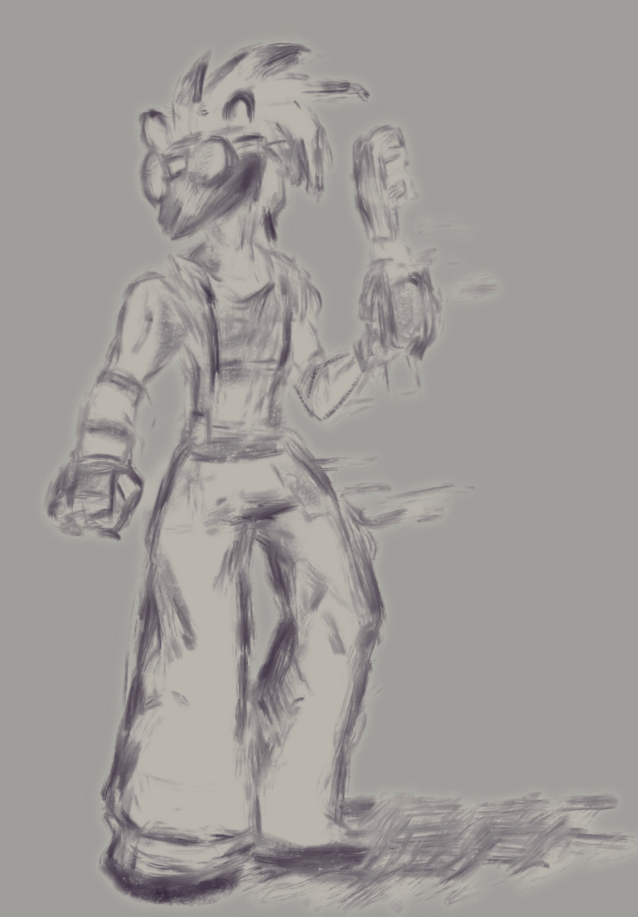
God her art is so freaking cool.
Fun fact, most of these folks are prolific furry artists. I told them I'm looking for a 60/40 split of "Human to UwU" ratio in their art. Let me know what furry references they hid in their artwork as I'm certain the snuck a good bit past me.
What went wrong?
I'm no so vain to say this was a perfect product. This was a first time effort and I had a lot to learn. Buuuuuuuuuut I do think the development went pretty smoothly. I did well to schedule my time on this to avoid burning out and crunching. I spent a month writing out the rules and ideas, and another month formatting everything together in Affinity Publisher. That said there's two areas I feel I could have improved on.
Firstly, playtesting. This was a major oversight and I think a huge failure on my end as a game designer. I only had a few sessions of running combat scenarios. So everything you see in the book works in theory but not all of it was practiced. I think the time old argument of "confidence vs stupidity" is applicable here. If I ever comeback to make a new edition of FIST: TACTICS I'm gonna spend at least half of the development just playing this game over and over.
Secondly, was art direction. I knew I wanted to lean into a PDA terminal style for the page look with a 1-bit coloring style. But when I reached out to the my artist friends to collab with them, the common questions I got was, "What exactly do you want me to draw?" "Who do you want me to draw?" "Do you have any character refs?". Apparently "Go wild" isn't the comforting statement I thought it was. In my head, I wanted this to be an opportunity for my friends to draw stuff they've never drawn before, or draw things they've always wanted to. Use characters they haven't given much love to and, to genuinely, go wild.
One thing I missed while studying other RPG book art. They all tend to have a common cast of characters that they refer back to. I think a great example is Savage Worlds Adventure edition, which used the same two characters throughout all the different settings and concepts. The FATE books use the same 4-5 characters in the same way. Unlike properties like Dungeons & Dragons or Mouse Guard, FIST and FIST: TACTICS don't have a huge backlog of characters and lore to go off of and refer back to. It's very loose-goosey. Miffix gave me some great advice for future editions, build and design a few characters that I can give to the artist's for references.
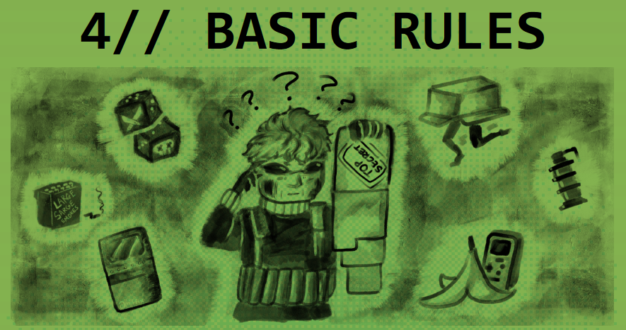
That said, it didn't stop Miffix from sneaking in one of her favorite one-shot characters into the book. I'll always make room for Maude, the exploding old-lady Miff ;3
So, what's next?
At the time of writing, the CLAYMORE guys just announced a new game jam for FIST that I'm keen on making something for. I'm not sure what yet but I'm asking around to some friends of mine to gauge interest, to see who's down to collab again. I don't have any strong ideas right now.
At about the same time I was working on the main book I took breaks by playing with tilesets again. Exploring fun ways for people to make "in theme" FIST: TACTICS battlemaps.
I played around with some Isometric designs for a while. First some grass and rocks:
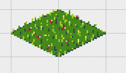
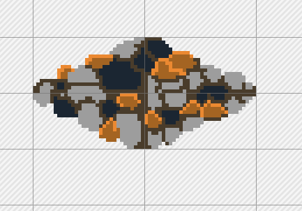
And then I tried recreating the VR-Mission styles from Metal Gear Solid and Revengeance:
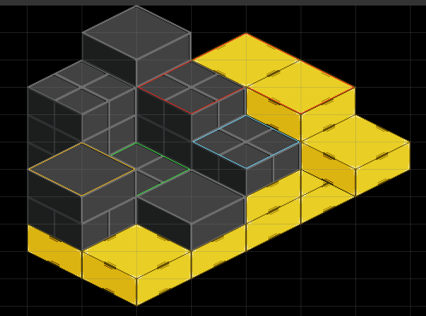
While I'm super happy with the how these tiles came out, I can't deny how hard it is working with Isometric tilesets. And more importantly, how awful the support for them are on Virtual Tabletops right now. The community as a whole has gone from superb top-down support to full on 3D worlds and with interactive elements while skipping over it's isometric roots. The big three VTT's, Roll20, Fantasy Grounds, and Foundry all have some level of support for isometric play but it always comes with some kind of caveat. Usually it involves paying for a premium service or some kind of sub-optimal integration. I love the look of isometric maps and I'd love to do more with them some day.
So I moved back to a top-down look. My first attempt went pretty far
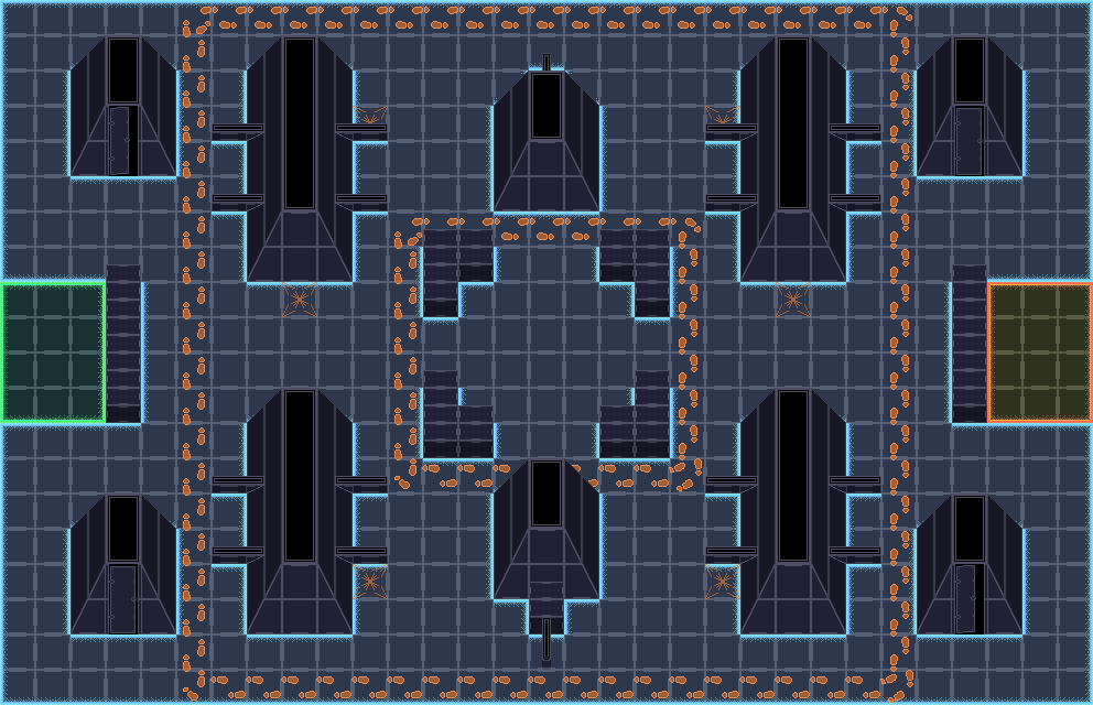
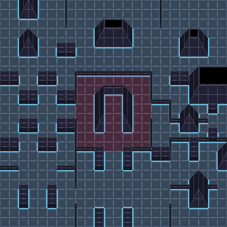
It looked like the VR missions, and used a similar style to Metal Gear Ghost Babel on the gameboy color. Lots of different walls and I'm still so tickled with how the "Guard Patrol Routes" look. But there are some fundamental issues with this rendition. The angled walls don't exactly line up accurately as you can see in the 2x2 wall blocks nor do they keep a consistent height. The thin walls don't have any good connectors and are way too thin to be easily read as "walls", and more importantly the color choices and design I went with are just way too busy. It's hard on the eyes and for an image that players are gonna be looking at for several hours, that's a problem. I had intended to release this sprite sheet pack with the full release of FIST: Tactics but it would have required a lot more work that would be better spent on the book itself. So I scrapped it.
This idea stuck in my head though for a long time. A few months after the launch I wanted to try another stab at it, this time with a much more limited palette and more easily defined walls. Here's a preview of what I've been working on:

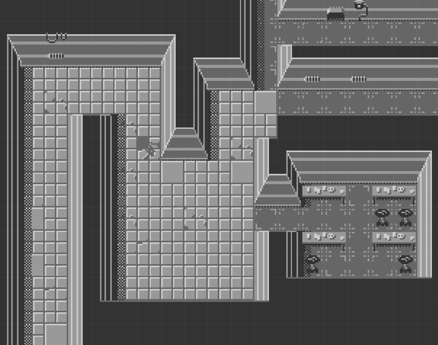
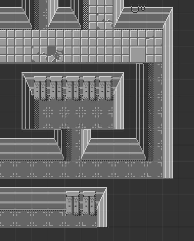
Oh yeah baby this could work. I'm really leaning into the gameboy style here, limiting myself to a 4 color palette. I also have enough variations of tile types to break up repetitive elements. If anything this was an excuse to play with the auto-tiling capabilities of LDtk. I'm pretty happy with where the sprite sheet is at right now, but I'd like to add more decorative pieces and new environment types. Here's an example of some "outdoor" sections I've been working on:
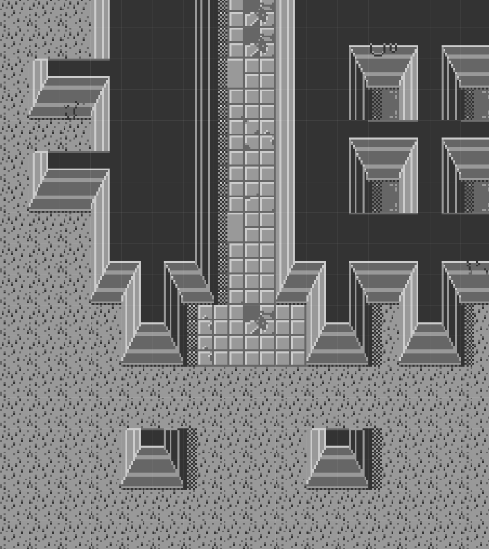
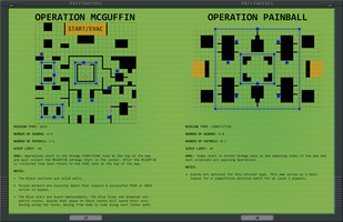
Such lovely spiky grass. I even remade one of the above skirmish maps with this new tileset:
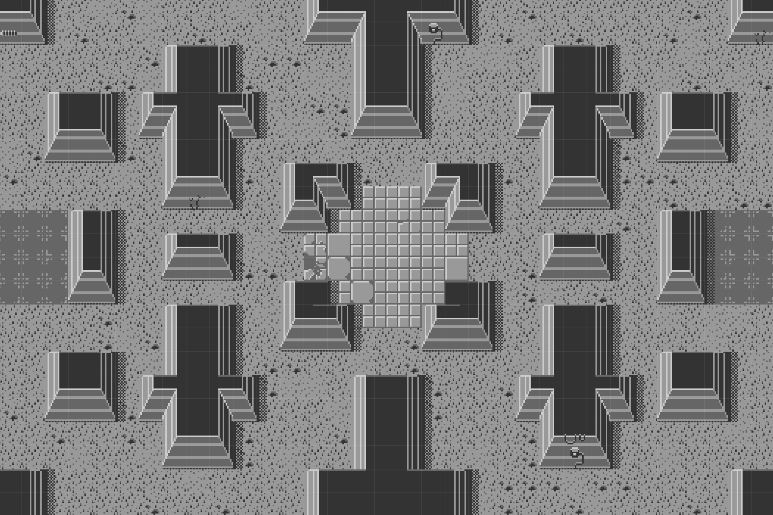
Now THAT'S a lot easier on the eyes I think.
Maybe I could expand on this for the Game Jam... hmmm....
In Conclusion
I hope this has been a fun look at the development of FIST: TACTICS. What came before, what got cut, and what is next in the pipeline. This is by far one of the most rewarding things I've ever worked on and I can't thank the CLAYMORE gents enough for the opportunity. I also want to thank all the people who downloaded and tried out the game, those of you who voted too are the real heroes of the game jam. It means a lot to know folks are going out of their way for all this. I never thought this would all come to fruition. I never thought I'd actually finish this darn thing. But here we are!
And if you got this far, thank you for reading my ramblings and supporting my silly little game. Here's to whatever comes next!
~ Kam
[TRANSMISSION END]
Files
Get FIST: TACTICS
FIST: TACTICS
A stealth focused Skirmish conversion of FIST ULTRA EDITION
| Status | Released |
| Category | Book |
| Author | Casually Nefarious |
| Tags | Lo-fi, Meme, PbtA, Pixel Art, rules-lite, Stealth, Tabletop role-playing game, War |
| Languages | English |
| Accessibility | Color-blind friendly, High-contrast |

Leave a comment
Log in with itch.io to leave a comment.